Vatsal Mandalia

Data Scientist and Analyst, proficient with Python, SQL, Excel, Tableau tools, with hands-on ability in data cleaning, data analysis and data visualization.
View My LinkedIn Profile
View My Tableau Public Profile
My Portfolio
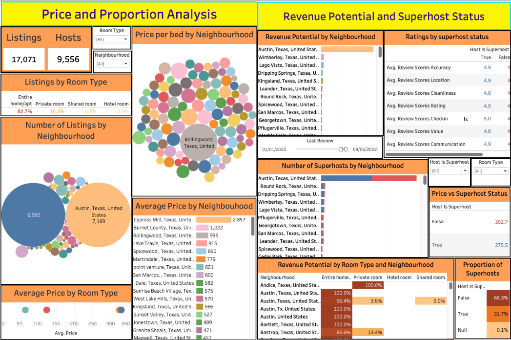
Airbnb Analysis in Austin
![]()
- Price, proportion, revenue and superhost analysis was done on 17071 listings in Austin on Airbnb with the data extracted from Inside Airbnb.
- 80% hosts were single listing holders, with Austin accounting for 42% listings. 30-day projection showed a 47% of the total revenue for Austin neighbourhood.
- ‘Price’ field is cleaned by manually removing non-numeric character ‘$’. Using CAST and REPLACE queries comma is removed from the values with data type changed to INTEGER.
- SQL queries are executed through DB Browser for SQLite tool.
PowerPoint Presentation:

Tableau Public:
Price and Proportion Analysis |
Revenue Potential and Superhost Analysis
Walmart Retail Sales Forecasting using ARIMA and SARIMAX
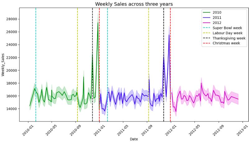
- Time series forecasting done for weekly sales in Walmart stores for 2013 with historical data of 45 stores and 99 departments from 2010-2012.
- Deep dive in holidays showed Thanksgiving getting 40% more sales than Labour Day, Super Bowl and Christmas.
- Thanksgiving and Christmas were target of retailers for Markdown events, with average markdown 6x more than in other holidays.
- Utilised Statsmodels library for applying ARIMA and SARIMAX models, with p,d,q parameters determined from ACF & PACF plots.
Recipients of USD10 million Financial Aid from HELP Organization
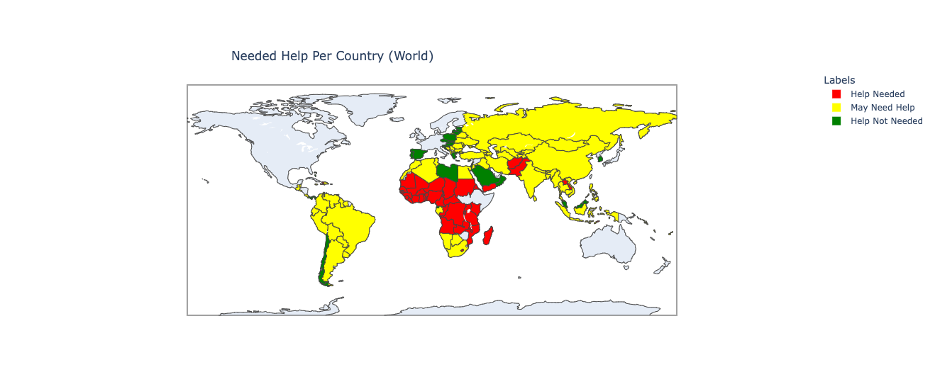
- Clustered 167 countries using 10 socio-economic factors to identify financial aid recipients.
- Scaled down the data using StandardScaler and managed outliers by capping them to avoid their effect on algorithm performance.
- After classifying, Plotly library in Python used to visualize the countries in three colours on a world map.
2020 Retail Sales Dashboard in Tableau
Sales analysis of retail stores in USA is done for 2020 in a dashboard created using Tableau.
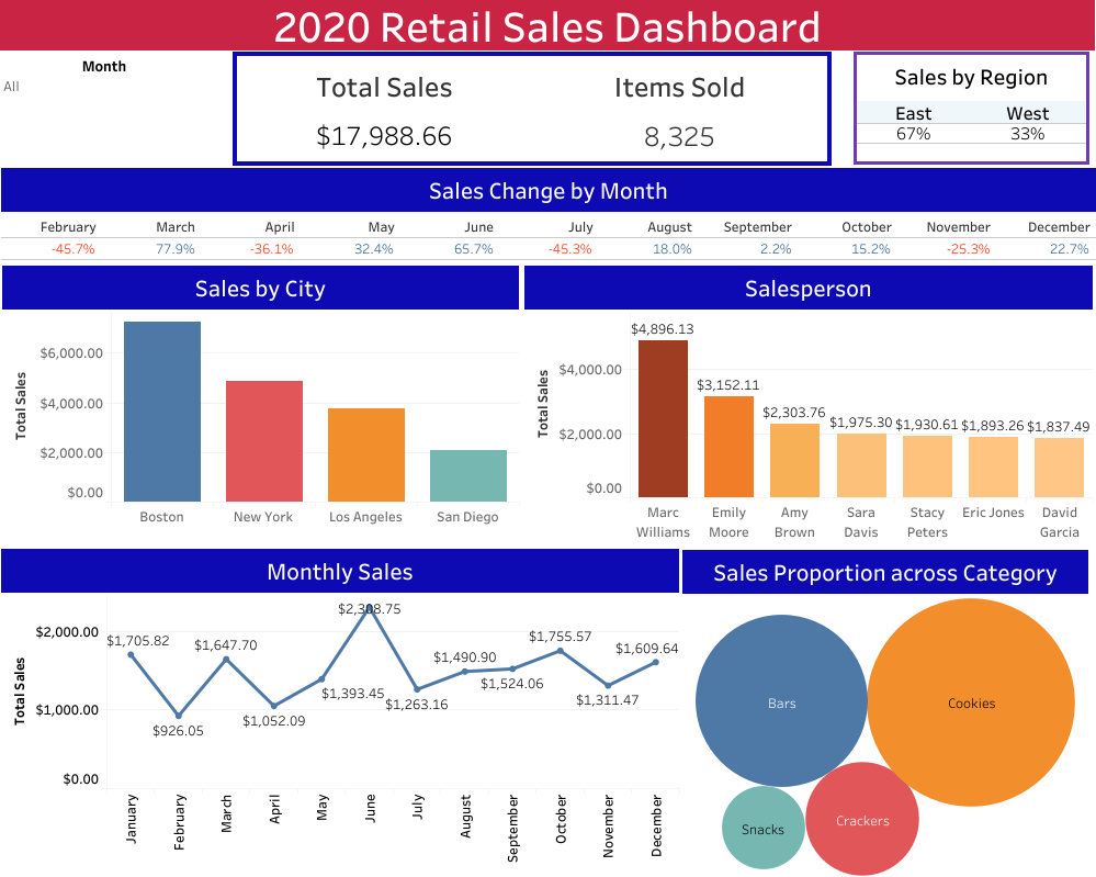
Relevant KPIs have been highlighted, correct charts are used to show the trends and patterns and filter on date is applied to give a flexibility to explore deeply into the data.
Page template forked from evanca